

A Man’s Ultimate Guide
Matching colors and patterns can feel intimidating, but honestly, it’s a lot simpler than most guys think.
The trick is just getting the hang of balancing base colors with accents, and choosing patterns that play nicely together rather than fighting for attention.
Understanding how colors interact and knowing which patterns create harmony is pretty much essential for any man who wants to look put-together.
You don’t need to be an artist—just a bit of curiosity and some practice goes a long way.

Start with classic base colors: navy, beige, brown—those never really let you down. Then, layer in bolder or more subtle shades with accessories or statement pieces.
Patterns shouldn’t compete for the spotlight. Try mixing a solid with stripes or checks, but don’t go wild stacking them all at once.
Once you get this balance down, your outfits start to look intentional and sharp, no matter where you’re headed. And honestly, it feels good to know you’ve got it handled.
If you’re looking to keep leveling up your style, join my newsletter! Each week, I’ll send you three pieces of style inspiration, the latest news and trends, plus a deep dive into the art of dressing, living, and being better. You’ll get the good stuff straight to your inbox—no fluff.
Key Takeways
- Use classic base colors, then add accents for personality.
- Combine patterns in subtle, complementary ways.
- Adapt colors and patterns to your style and the occasion.
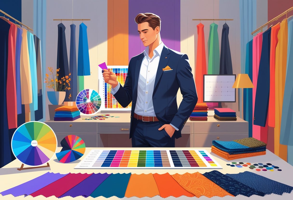
Mastering the Fundamentals of Color Theory
To match colors and patterns well, you’ve got to know how colors relate. The color wheel isn’t just for art class—it’s a genuinely useful tool for building outfits that work.
Understanding the Color Wheel
Picture the color wheel as a circle showing how colors connect. It’s split into slices, each one representing a different shade in a logical order.
Primary colors—red, blue, yellow—are spaced evenly around the wheel. Mix two of those together, and you get secondary colors like green, orange, and purple.
The wheel’s layout makes it easier to spot which colors harmonize and which ones will really pop against each other.
Primary, Secondary, and Tertiary Colors
Primary colors are the foundation: red, blue, yellow. You can’t mix those from anything else.
Secondary colors—green, orange, purple—come from blending any two primaries.
Tertiary colors fill in the gaps. Think yellow-green or red-orange—those come from mixing a primary with a neighboring secondary. Suddenly, you’ve got a much richer palette to play with, especially if you’re bored of the basics.
Complementary and Analogous Colors
Complementary colors sit directly across from each other on the wheel—like blue and orange, or red and green. Pairing them gives you maximum contrast.
Analogous colors are neighbors on the wheel—blue, blue-green, and green, for example. These combos are smooth and easy on the eyes.
Both approaches are great for designing outfits—sometimes you want big contrast, sometimes you want things to flow.
If you’re curious about digging deeper, check out this comprehensive guide on mastering color theory.
The Art of Combining Colors in Men’s Outfits
Getting color right can make or break your look. It’s about balancing shades, leaning on neutrals, and layering colors thoughtfully.
There are some simple rules rooted in color theory, but also a bit of personal taste and practicality.
Building Outfits with Neutral Colors
Neutrals—black, white, grey, navy, brown—are the backbone of any solid wardrobe. They’re easy to build on and rarely clash.
Start with a neutral piece, maybe a navy blazer or grey pants. That’s your foundation.
It gives you room to add brighter or more daring colors, without things getting messy.
Neutrals also make life easier. A white shirt goes with just about everything, and a dark brown jacket tones down louder pieces.
Try to stick to two or three colors in an outfit, with at least one being a neutral. More than that, and things start looking a bit chaotic.
Applying Effective Color Combinations
There are a few tried-and-true combos:
- Monochromatic: Different shades of the same color. It’s simple and always looks sharp.
- Analogous: Colors next to each other, like blue and green. Super easy on the eyes.
- Complementary: Opposites attract—blue and orange, for instance. Just don’t overdo it.
Mixing color intensities matters too. A bright color paired with something muted usually wins over two bolds fighting for attention.
Navy and white, or grey and burgundy, are classic for a reason—they pop, but not in a loud way.
Using Color Hierarchies for Coordination
Think of colors in your outfit as having roles: base, complementary, and accent.
- Base (60-70%): The big piece—pants or jacket, usually a neutral.
- Complementary (20-30%): Adds interest, but doesn’t steal the show.
- Accent (5-10%): The fun bit—ties, socks, pocket squares.
This keeps things balanced. A grey suit (base), light blue shirt (complementary), and red tie (accent) just works.
Having this structure in mind stops things from getting too wild or, honestly, too boring.
Mixing Patterns with Confidence
Mixing patterns isn’t about being loud—it’s about making smart choices so things look intentional, not random.
The right mix relies on color, size, and the balance between bold and simple. It’s a bit of an art, but you can definitely get the hang of it.
Essential Rules for Mixing Patterns
Stick to three to five colors, tops, for your patterns. Patterns should share at least one color—it ties everything together.
Vary the types: stripes with florals, checks with dots, geometric with organic. Don’t double up on the same pattern type if you can help it.
Keep it to three patterns max. More than that, and it’s chaos.
Neutrals like beige, black, or navy as a backdrop help ground your look.
Repeating a color or texture across patterns makes the whole outfit feel like it’s working together, not just thrown on in a rush.
Pairing Patterns with Solid Colors
Solids are your safety net. They give the eye a break and keep patterns from overwhelming the outfit.
Pick solid pieces in neutrals or colors that show up in your patterns. For example, solid navy pants with a striped shirt and a floral jacket—if navy is in the print, it all comes together.
Solids help bold patterns stand out, and they’re a simple way to dip your toe into mixing without going overboard.
Balancing Scales and Proportions
Pay attention to the size of your patterns. Mix large patterns with smaller ones for contrast.
A big check shirt pairs well with a tiny polka dot tie. If you go big on both, it’s just too much.
Try smaller patterns near your face, larger ones on bigger pieces like jackets or pants. It keeps your look sharp and intentional.
If you want a deeper dive, here’s a great read: master the art of mixing patterns like a pro.
Mastering Contrast and Accent Choices
Using contrast and picking the right accents can really take your look up a notch. It’s about knowing where to put those pops of color or pattern for maximum effect.
Using Contrast for Visual Impact
Contrast makes colors pop and draws the eye right where you want it. Complementary colors—blue and orange, red and green—are a quick way to get that effect.
High contrast between light and dark, like navy and white, is bold without being too much.
Try not to mix too many similar tones, or your outfit might look a bit muddy. Clear distinctions are your friend.
Contrast works great in big pieces, like jackets and pants, but also shines in little details—a belt or a watch strap can make a difference.
Selecting Accent Pieces
Accent pieces let you show a bit of personality. Ties, watches, pocket squares, shoes—these are your playground.
Pick accent colors that complement your main palette but still bring something new.
One or two bold accents are plenty. A bright coral tie with a blue suit? That’s memorable, but not over the top.
Incorporating Secondary Colors
Secondary colors—green, orange, purple—give you more options, but use them thoughtfully.
Toss them in as layers or accessories to support your main colors. A green scarf with a mostly red outfit, for instance, can add depth without clashing.
Understanding how these relate to your base and accent colors keeps everything harmonious.
Practical Styling Tips for Real-World Scenarios

Mixing colors and patterns well is about thoughtful choices—balance, scale, and harmony. Sometimes, simple combos and smart use of neutrals are all you need.
You can adjust for different occasions and use accessories to keep things interesting and polished.
Creating Balanced Looks for Different Occasions
Formal events? Stick to classics—navy and white, grey and black. Choose one pattern, like a striped tie with a solid shirt.
Neutrals soften things and keep bold patterns grounded.
Casual settings give you more room to play. Try a large plaid shirt with a small-scale geometric print—just don’t go overboard.
Limit yourself to two patterns per outfit. It keeps things intentional and not overwhelming.
Color harmony helps too. Blue and orange together? Sure, just don’t let them fight for attention.
Accessorizing with Color and Pattern
Accessories are the easiest way to sneak in color or pattern. A patterned pocket square or striped socks can totally change the mood of a plain suit.
You don’t have to match accessories perfectly—just coordinate. A tie with a hint of red works with a navy blazer.
Small patterned accessories add interest without making the outfit feel busy.
Avoiding Common Mistakes
Too many patterns and it all falls apart. Keep it to three max, and always break up busy elements with neutrals.
Don’t ignore scale—mixing patterns of the same size can flatten your look. Pair big with small for depth.
Stick to a palette of 3-5 colors. It’s the easiest way to avoid clashing and keep your outfit looking intentional.
For more on balancing scales and mixing patterns, check out this guide: how to mix patterns like a pro.
Tailoring Your Approach to Your Complexion
Choosing colors that flatter you comes down to knowing your skin tone and understanding how contrast works for you.
Seasonal color guidelines can be surprisingly helpful for figuring out what suits you best. Combining colors with these factors in mind gives you a wardrobe that just works—no fuss, no guessing.
If you want more style advice, news, and inspiration, don’t forget to join my newsletter. You’ll get hand-picked looks, the latest trends, and a weekly dose of motivation to dress, live, and be better—straight to your inbox.
Matching Colors to Skin Tone
Skin tone—it’s one of those things you hear about all the time, but does anyone really know their undertones? Most people fall into cool, warm, or neutral categories.
Cool undertones usually show a bit of pink, red, or even blue. Warm? Think yellow, gold, or peachy hues. Neutral is that in-between space, a mishmash of both.
If you’ve got cool skin, you’ll probably notice blues, greens, and purples just look right on you. Guys with warmer skin? Earthy tones—browns, oranges, those rich reds—tend to pop. Neutral skin is the wild card; you can get away with almost anything, which is honestly pretty lucky.
The color wheel isn’t just art class nostalgia—it actually helps. Cool undertones? Try jewel tones. Warm skin? Go for those deep, muted shades. It’s not an exact science, but it gives you a solid place to start.
Contrast Types in Personal Style
Contrast is all about the difference between your natural features and what you wear. High contrast means, say, dark hair and light skin. Low contrast? Everything’s a bit closer in shade.
If you’ve got high contrast going on, bold color combos like black and white or navy with pale gray are your friends. For low contrast folks, softer, tonal mixes—think similar colors layered together—tend to look more natural.
There’s this thing called the rule of three—basically, don’t go wild with your palette. Three colors max keeps things looking pulled together, not like you got dressed in the dark.
Seasonal Color Guidelines
Seasonal color theory splits everything into four groups: winter, spring, summer, and autumn. Each season lines up with certain skin undertones and hair colors.
- Winter: Cool undertones, crisp shades—icy blues, sharp black, true red.
- Spring: Warm undertones, light and fresh—peach, coral, light green.
- Summer: Cool undertones, but softer—dusty rose, lavender, pale blue.
- Autumn: Warm undertones, deep and rich—burnt orange, olive, mustard.
If you want to get nerdy about color and complexion, check out this guide on color analysis and matching colors.
By the way—if you’re into this kind of style know-how, I send out a weekly newsletter with three pieces of style inspiration, the latest news, events, and trends, plus a deep dive into dressing better, being better, and living better. You should totally join.
Frequently Asked Questions
Matching patterns is a bit of an art. You want to balance size, color, and how bold each piece is so nothing feels out of place.
What are the essential rules for matching patterns in men’s fashion?
Stick to one main bold pattern—no need to look like a walking wallpaper sample. Mixing sizes, like big checks with tiny dots, keeps things interesting. And if you’re not sure, throw in a solid neutral. It almost always works.
How can a man effectively combine different clothing colors?
Start simple. A few core colors are all you need for a solid look. Complementary or analogous colors from the wheel help you dodge awkward clashes. Mixing warm and cool tones? It can add some depth, but don’t overthink it. Solids help ground the outfit if you’re feeling wild with patterns.
Which color combinations are considered classic for a male wardrobe?
Navy and white—never fails. Black and gray? Super versatile. Earth tones like beige and brown always look good together. Blue and gray is another easy win, especially if you want something sharp but not too flashy.
What tips can help men match their clothes without consulting a color chart?
Keep it simple: black, white, and gray go with nearly anything. Pair a single bright color with neutrals if you want to stand out without looking like a traffic cone. Mixing textures and patterns—like smooth with rough, or small with large—keeps outfits from feeling flat.
How to coordinate clothes for a casual yet stylish men’s look?
Pick one piece to stand out—maybe a patterned shirt or a textured jacket. Then balance it with solid pants or jeans in a color that works. Accessories? Match the vibe, but don’t go overboard. Subtle is usually best.
And hey, if you want more tips like these, don’t forget to sign up for my newsletter. Each week, you’ll get fresh inspiration and a closer look at how to dress, act, and just live a little better.
What advice would you give for selecting the best color outfit for a man’s body type?
Dark colors usually slim things down, so they’re a solid pick if you’ve got a bigger frame. On the other hand, lighter or brighter shades? Those can really make features pop, and they tend to look great on leaner body types.
When you’re picking colors that sit near your face, try to find ones that actually lift your skin tone instead of making you look tired. It’s a bit of trial and error, honestly.
If you’re into this kind of style talk, you might want to join my newsletter. Every week, you’ll get three fresh bits of style inspiration, the latest news and trends, plus a deep dive into dressing, living, and just being better. It’s a good time—promise.
Leave a Reply